Michael English
Graphic artist and rock band member whose posters encapsulated the swinging 60s.
Written by:
Michael McNay
Michael English in the late 1960s
The 1960s was when ephemera became non-ephemeral. Starting from small boutiques in Chelsea, Mary Quant and Barbara Hulanicki conquered the known world and Jean Shrimpton was crowned queen; Alan Aldridge proved that covers sold Penguins; each successive Beatles album sleeve became as collectable as the vinyl within; David Bailey inspired Michelangelo Antonioni to mythologise the scene in his movie Blow-Up; and Time magazine pronounced the benediction. With the passing of the 60s, none of this curled up into yellowing heaps of fading memory. Instead, it has gained a quasi-immortality in the salerooms and on eBay – among it the early work of the artist Michael English, who has died aged 68, after five years of suffering from bone marrow cancer.
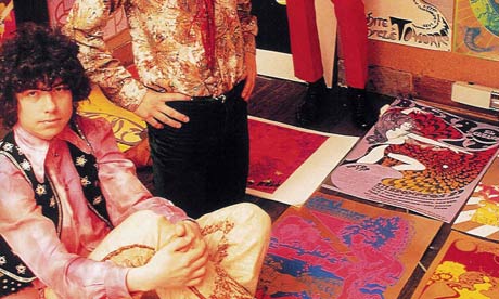
English's epiphany was the moment in King's Road, Chelsea, in December 1966 when he chanced upon the graphic artist Nigel Waymouth painting the facade of Granny Takes a Trip, London's first psychedelic boutique. Together they created a graphics team doubling up as a rock group called Hapshash and the Coloured Coat. This kind of music and this kind of pop art seemed natural bedfellows; both emerged from the art schools to which, before educationists pasted on an academic veneer, kids had no need of any passport but talent.
English studied at Ealing art school in west London, where Roy Ascott had introduced an innovative method of inducing creativity called the ground course. Ascott had studied at Newcastle upon Tyne under Richard Hamilton. And so it goes. Hamilton was the intellectual face of pop art, operating at a cool remove from the actual pop scene, commenting on it without being directly involved. Ascott was a facilitator, and English became the most prolific producer of pop art at the interface with the real admass – a potent mix of art nouveau with hard-edge sci-fi applied to disposable items such as union flag sunglasses, T-shirts, carrier bags, and graphics for the underground paper International Times.
Most of all there were the posters, for the UFO (Unlimited Freak Out) club in Tottenham Court Road, for Pink Floyd and Jimi Hendrix, in favour of saving the Earth (already), a glorious sunburst for a Hapshash album sleeve and, prescient of work to come, a sensual, vermilion painted mouth with gleaming white teeth spilling out tendrils blossoming into fat letters like lush tropical fruit spelling out "Love festival". However amorphous the 60s prescription for love to save the world, in his own life those close to English testified to his kindness, warmth and loving nature.
The unlikely source for the general burst of graphic creativity was the Victoria and Albert museum, that vast mausoleum of the art and artefacts of empire which nudged the zeitgeist with exhibitions of Aubrey Beardsley and the Czech genius of art nouveau, Alfons Mucha. The images emerging from the languid and insolent decadence of their spiralling line held immense appeal for the 60s generation, and Hapshash and the Coloured Coat made the most of it.
English was born in Bicester, Oxfordshire, and, like a lot of children in service families, was constantly on the move. His early education was at a series of boarding schools. After the second world war his father, Nigel English, left the RAF and worked for the electrical engineering firm Ferranti. Some of this may have rubbed off on his son, because when Michael tired of the 60s scene after the total flop of a Hapshash musical gig in Amsterdam in 1968 ("We lost the plot," Waymouth later confessed), he worked his way through to an unabashed style of hyper-real art celebrating the triumph of commerce.
The engorged lips of the love festival poster mutated now into lips blowing an improbably beautiful transparent globe of bubblegum or viscously spilling syrup. The fascination with surfaces produced possibly the best known of his pieces, the Coke bottle cap of 1970, bent after being removed by a bottle opener and splashed with liquid. The same year saw a crushed can of tomato juice spilling its thick red liquid, and an SR toothpaste tube with the paste oozing forth in a serpentine ribbon recalling the art-nouveau wrigglings of his first works.
He moved on to industrial hardware, objectified like sexual fetishes: a wheel and pistons of a railway engine, an aircraft jet fan, a truck's diesel filling cap, a smashed bottle lying on a bed of moss. And in all these, the paint surfaces, the hints of rust, the dangerous edge of broken glass appear with a heightened fidelity that made him the must-hit target for advertising agencies.
And so English loaned his talents to marketing the products of such diverse companies as Bertolli, Swiss Air, BA and Porsche. All along he yearned to go straight, to paint like a "real" artist. He went to the Seychelles for subject matter and came back, of course, with hyper-real natural imagery. He painted it proficiently but his real talent lay in romanticising the chill seductiveness of the machine age, a talent reprised with designs for special postage stamp issues in 2001 (old London buses) and 2004 (vintage motorbikes).
His wife, Jaki, survives him, and is organising a show of his work.
Michael English, artist, born September 5 1941; died September 25 2009
guardian.co.uk © Guardian News and Media Limited 2009

No comments:
Post a Comment